

My Favorite Pricing Pages
My Favorite Pricing Pages
The perfect pricing page doesn't exi...

Happy Thursday,
And to my new subscribers, welcome to the underground where we push the limits of my intelligence and explore the world of subscription pricing. Thank you to all of you who have reserved a small portion of your inbox for me every other Thursday 🙏🏼.
It appears some of you appreciated the reading shares from last week, so doubling down on a few more here. My favorite reads over the past two weeks were…
On the pricing front, out of 16 pricing conversations since June 29th, I was asked about…
Buyer Personas ⇒ 2 times
Moving Downmarket ⇒ 4 times
Moving Upmarket ⇒ 6 times
Changing Value Metrics ⇒ 4 times
Usage Pricing ⇒ 1 time
Packaging ⇒ 11 times
Multi-Product Bundling ⇒ 4 times
Pricing for Profitability ⇒ 3 times
Today, we’re going to talk about my favorite SaaS pricing pages.

Sometimes we all just need to take a step back and appreciate the stars shining a bit brighter than the others. I’d like to celebrate the companies who have put in the time and effort to nail their pricing page and pull out a few takeaways relevant for all of us in the space.
Before I do so, a few disclaimers…
First, A great pricing page does not necessarily indicate a great pricing strategy.
Think of your pricing page as a metaphorical bridge between you and your customers. To a layman like me, all bridges may look similar in nature but the best are probably comprised of something like prestressed concrete and structural steel whereas the weaker ones may be old and made of unreinforced masonry. There’s a better analogy but you get what I mean. I’m commenting only on the page, and missing much of the necessary data to evaluate the broader strategy.
Second, these are my opinions. I happen to have a job where I look at anywhere between 5 - 20 new pricing pages any given week so hopefully I’ve garnered enough knowledge to steer you in the right direction here, but alas, you’re reading the perspective of a person who also defends the catalog of Tom Cruise over Tom Hanks (it’s a corner I’ve backed myself into over the years).
Lastly, I’ve chosen to evaluate each page on the following axes at the direction of my team (all on a 1-5 scale):
Clarity - the degree to which the page clearly articulates the solutions and value propositions of each offering.
Simplicity - the degree to which the page is easy to navigate and understand.
Transparency - the degree to which the page is providing necessary information for a prospective buyer to make an informed decision.
Expansionary potential - the degree to which the buyer will have natural expansion paths as they attain more value from the product.
Alright, now that that’s out of the way, let’s dive in!
First up, we have two honorable mentions:
Canva - 4/5
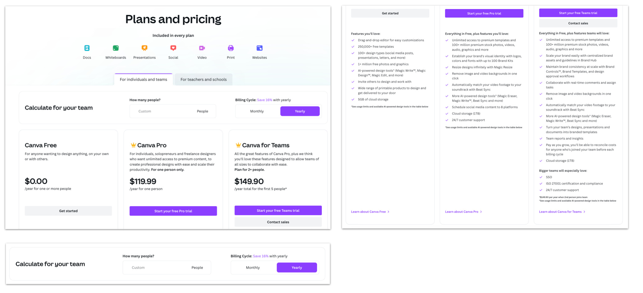
Clarity - 3/5
Simplicity - 4/5
Transparency - 5/5
Expansionary potential - 4/5
Aside from helping me build my ever-anticipated newsletter logo, Canva has built one of the most dominant B2C SaaS companies in the world. They’ve come to be known for their simple UI, extensive resources of templates, and ease of collaboration. And they also have a great pricing page.
B2C companies like Canva have to tow a delicate line between simplicity and information sharing as their buyers likely aren’t crafting unique business cases to their CFO before purchasing, but rather making an emotional decision on the website.
Where Canva thrives is in transparency. They put all their cards on the table and trust educated buyers to sign up quickly. They’re lacking a bit, however, in clarity. Canva has a wide range of features in each package and although all are informative, some might be overkill in aligning with the use cases of each of their buyer personas.
Workable - 4.25/5

Clarity - 4/5
Simplicity - 4/5
Transparency - 5/5
Expansionary potential - 4/5
Workable has put together one of the more aesthetically pleasing pricing pages you’ll come across. They’ve done a great job building an engaging and easy-to-navigate page for a wide spectrum of potential buyers. Although each package isn’t persona-tailored, they’ve added three simple, yet informative value propositions at the top of each package allowing their prospective buyers to quickly identify which plan is right for them.
They’re also doing a great job leveraging add-ons without over-complicating things, flexing Video Interviews, Texting, and Assessments above the fold at an additional cost.
Where they may be missing the mark slightly, is on their packaging approach. Workable doesn’t have much feature differentiation. I counted 39 features, all of which are provided to every customer. In some cases, this can work; however, in Workable’s case, I have to imagine use cases vary enough to the point where not all buyers need things like “Advanced Access Rights” or “API access”. They may be able to capture a bit more expansionary revenue by breaking their features into the tiers they’ve already built.
…and now, our medalists:
🥉Airtable - 4.25/5

Clarity - 4/5
Simplicity - 4/5
Transparency - 5/5
Expansionary potential - 4/5
Airtable has grown as a market-leading solution for creating structured databases and because of their positioning as being an intuitive solution to complex problems, their pricing page becomes a critical first line of defense.
As you scroll through the page, a few things jump out.
They have simple and informative value propositions on each tier; a necessary building block for effective packaging.
For individuals or very small teams just getting started with Airtable
For teams looking to create connected apps to manage their own workflows
They present their value metrics with ease as the first thing a buyer sees before scrolling through features. I’m a fan of this for Airtable because their buyers likely lean pretty technical and want to know things like “How many extensions vs records will I get in each plan?” before evaluating the extensive feature list.
Airtable also delineates their features clearly by bucketing into categorical sets (i.e. Customization, Admin, Support, etc) rather than having a randomized assortment.
Where they may be missing the mark is in leveraging add-ons. From what I can see, Airtable isn’t breaking out any features separate from others to sell a la carte which could be hurting them from an expansionary standpoint.
🥈 GitLab - 4.5/5

Clarity - 4/5
Simplicity - 5/5
Transparency - 4/5
Expansionary potential - 5/5
Given I’m not a developer, I’ve never used GitLab or ever had intentions of buying. But that hasn’t stopped me from following their pricing transformation since 2020. When I get questions about pricing page design for technical products (aesthetics, simplifying complex features, etc), I point to GitLab.
Aside from checking just about every box needed on a stellar pricing page, they’re also capitalizing on a sneaky hybrid model. In each tier, GitLab affords their buyers a specific amount of Compute Power and Storage. For folks who exceed their storage limit but don’t want to upgrade tiers, GitLab provides an easy upgrade path via add-on usage ($10 and $60 per bucket respectively).
In a world where pricing being tied to value is as important as it’s ever been, this tactic is terrific. It allows them to enjoy the fruits of recurring revenue (from user sign-ups on tiers) and also usage pricing for those capturing more value from the product.
Where they may have an opportunity for improvement is in their value propositions. Currently, their value props may be a bit too boiler-plate where they could lean further into product/persona fit:
Essential features for individual users
Enhance team productivity and coordination
Organization-wide security, compliance, and planning
🥇 Notion - 4.75/5

Clarity - 5/5
Simplicity - 4/5
Transparency - 5/5
Expansionary potential - 5/5
If you haven’t crossed paths with Notion, allow me to very quickly nudge you to go do so. They’ve built one of my favorite SaaS products and have totally reshaped how I organize my professional and personal life.
Their pricing page is, in my opinion, a fantastic embodiment of how SaaS companies should be presenting to prospective customers.
Starting with clear and concise value propositions, Notion enables each buyer to quickly identify where they fall, notably segmented by size - intentionally not leaning into specific roles and verticals.
Once a buyer self-selects the optimal tier, they pave the way for clear expansion paths through the product. They throttle primarily on user count and sharing capabilities. This means, as one member of a team evangelizes to others, Notion will capture the additional value without hurting the individual’s experience. The flip side of this approach might have been to limit the number of pages, thus forcing the user to upgrade once they reached their limit - this, however, would disincentivize usage and potentially hurt free-to-paid conversions.
Aside from the team-focused expansion path, Notion also separates their AI feature as an add-on, which as many of you know, is a phenomenal way to capture additional revenue from new and existing users (rather than simply including AI in the “Plus” plan, for example).
And from a design standpoint, despite having a fairly diverse set of features, Notion presents each plan simply and clearly on an easy-to-navigate landing page leading to an optimal buying experience for dummies like me.
I know there’s a good chunk of companies not included in this list, and it was surprisingly difficult to exclude many of them (though depending on feedback here, I may share more pricing page breakdowns in the future).
For those focused on pricing page design, hopefully, this provides some inspiration for your next iteration of pricing changes.
As always, feel free to email me with follow-up questions and reactions here, happy to chat through each in more detail.
See you in 2 weeks!
-Evan
Great breakdown, thanks for sharing.
Love the bridge analogy!